

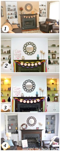
Yes, I painted the built-ins…again. A month or so ago I asked for your feedback about this. I painted them green but was not real happy with it. I got lots of opinions (all wonderful and kindly given – THANK YOU!). At the end of the day, I went with my gut and painted them gray. I had originally steered away from gray because I felt like “everyone” was doing it. You know, I was trying to be original. FAIL! Be like the cool kids, embrace gray. That’s what I learned. So I painted the backs of the built-in shelves gray. I LOVE IT!!
In case you missed it, here was the progression of the wall color and built-ins.
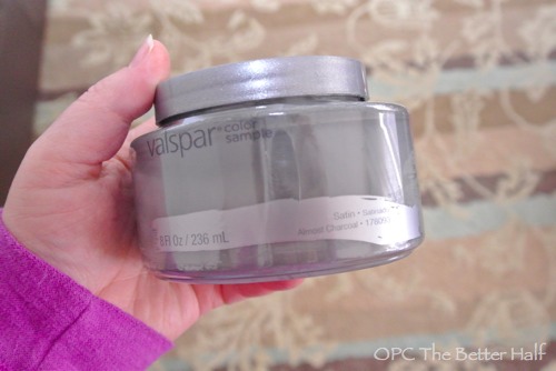
I haven’t tried Valspar paint in a long time, mainly because it was such crap that I steered clear! But, I was over that way and decided to give it a try. Turns out they had small 8oz. pre-mixed paint colors of their seasonal favorites for $2.99.
If you haven’t picked this up, I am an impulsive decorator. I go with my gut, add a little laziness, and pray to not have an epic fail.
So I grabbed 2 small containers of satin – one “Almost Charcoal” and the other “Hazy Stratus.” Once home and out of the fluorescent lights, I thought the first was too dark and the second, too light. So being to cheap and lazy to go back, I mixed them together and prayed. I like to call it ‘Hazy Charcoal” – lol!
Turns out to be one of my more genius impulsive decisions, because I love it. Also, Valspar paint was wayyyyy better than the last time I used it. The gray covered the green in one coat with a little touch up afterwards.
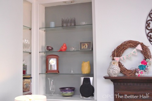
You can see the color best with the spot lights off:
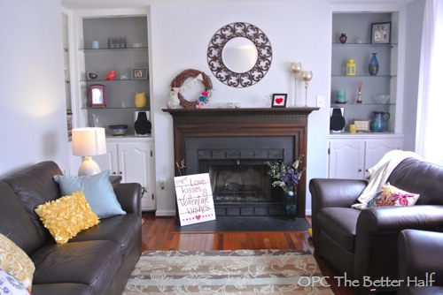
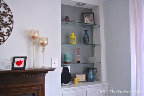
Now with the light on. Prettier in person, for sure!
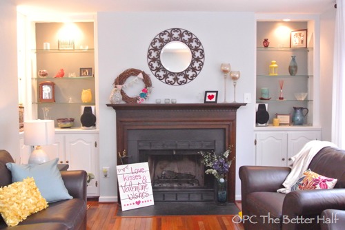
I also thought I would highlight some of my decor – some new, some old.
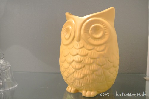
This is my little owl I brought home from our Rust- Oleum trip a couple of weeks ago (wearing a new color).
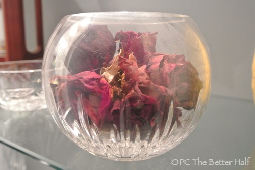
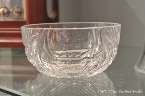
A Vera Wang crystal bowl we were given for our wedding, filled with the roses from my wedding bouquet – full of dust and sentiment.
A crystal Claddagh bowl that we purchased on our trip to Ireland shortly after we were married. We went to a crystal shop and saw them carve this bowl!
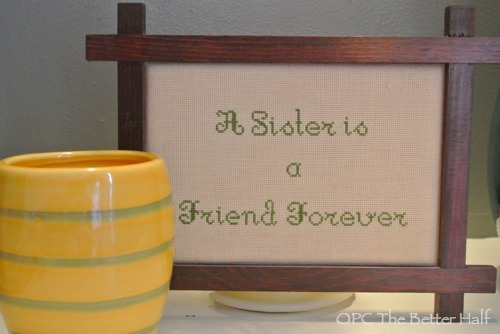
My grandmother and her sister (my great Aunt Edith) were best friends and Aunt Edith gave this needle point to my grandmother. It was passed to me and means a whole lot because my sister is my best friend. I hope Erin and I grow old and senile together, sharing lots of wonderful and crazy memories like Gran and Aunt Edith (minus the senile part, lol).
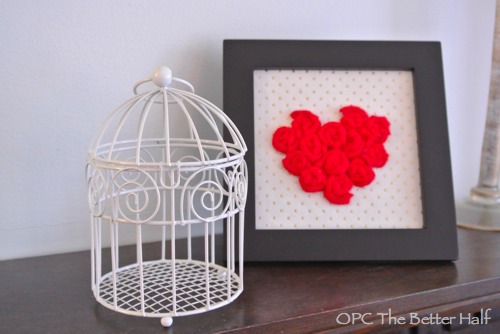
You may recognize this little felt rosette heart frame I made from Valentine’s. Well, I know Valentine’s has past, but the frame remains. Anyway, I found this cute birdcage in the dollar bin at Michael’s and bought a couple. Don’t be surprised if more pop up! lol.
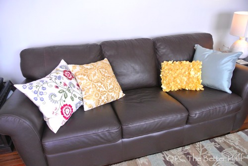
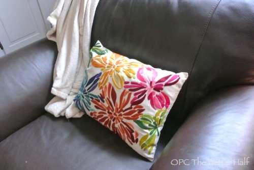
Next up – Pillows!!! They don’t go on the built-ins, but are also new to the room. I found them at Pier 1 and am in love. Ethan thinks the girls are going to destroy them, but I’m hoping they see how beautiful they are and chose to be kind! lol. I also debated making more pillows, but I love the texture and embellishments, which would be impossible for me to replicate. I may end up making the blue solid pillow (saving a bunch of money) or I may end up being lazy. We’ll see…
What do you think? Which is your favorite color so far (number 1 – 4 from the first picture above)?
Thanks so much for reading along about my painted built-in shelves!


Love the gray, Jocie! 🙂
Great, spur of the moment, choice! I am not a fan of Valspar paint and I have given them many chances to grow on me. Mainly, I find the paint to be too thick. That said, I will use it if the color is what I want. I know there is color matching to another brand, but I don’t think that works out as well sometimes.
Lastly, you and I have very much the same living room set-up, except I don’t have built-ins…, yet.
Thanks for sharing, I love the gray. I love ‘sample pots’ even more. The possibilities are endless.
Thanks, Christine. I have felt similarly about Valspar. This was a good experience, but I’m not sure it was good enough I would paint a room with it…
I think the gray is more similar to the blue-gray walls and is a good look.
First of all, love them in the grey!!! I bought that same sample two weeks ago for a project and am in love with the color!!!
Love the grey!! So pretty. So is the owl by the way :).
Love it! I used those paint samples on my gray striped curtains, those little samples are the perfect way to try new colors or do small projects for cheap. Yours looks great!
I love the gray! It looks so elegant. Just beautiful!
I really love the gray, it brings the whole room together SO well!!
The grey looks great. I guess it just shows that things are popular for a reason.
Yellow and gray make a terrific pair- you knocked this out of the park
love the gray too! really pops but keeps a neutral fresh pallete!
LOVE the grey, its neutral but edgy! Great job.
You did the best thing Jocie, you went with your gut. It never lies. The hard part, sometimes, is letting it speak without all those other voices interrupting.
I absolutely love the look of the grey. It is my favorite by far!
Now the real question: is it grey or gray?! 🙂
I was just in Lowes and picked up a few of those little pots of paint too! I just couldn’t resist.
The built ins look great!
You nailed it! So elegant looking.
Love the new color. You should call it Almost Stratus instead, because it looks quite heavenly 😉
heehee, i like that name Sheila! 🙂
Simple and fabulous! I love painting a contrasting color on the back of shelving! One of the best little cheap updates you can do, in my humble opinion!
Thanks so much Courteney! 🙂
I still like the warmth of the first one (the original), but I def like the gray as well. Good choice!
I thought you might say that! 🙂
I love 3 and 4 and that little owl – too cute! Love all the fun items tucked in your shelves!
Very pretty! I love that shade of gray!
Jocie, I LOVE IT!!! Maybe not original, but beautiful :O) And what you do best is showing all us inexperienced ones how to be trendy for cheap 🙂 So Way to go!
I love the gray! Makes it look nice and clean!
I’m loving the gray! Love your owl too. I saw we have this ugly copper owl bookend and I went and picked him up and looked him over…steve said, you tossing him because he’s tacky? Nope. He’s getting a paint job! He’ll be adorable after a little TLC.