

A month or two ago (maybe more), I started to re-design our living room. I had planned on doing it fairly quickly, but once we painted, I got distracted on other projects and the holidays. Here was the before:
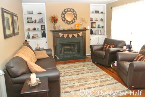
Now that we’ve painted the walls a light, icy blue:
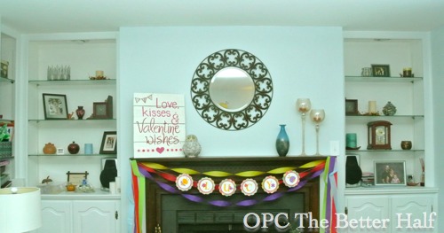
I had been playing with the idea of either doing a stenciled wall (on the wall space above the fireplace) or paint the backs of the built-ins.
In the end, I decided to paint the built-ins because stenciling the wall would be a lot of work and too much patterns if I kept the mirror which I love.
Then came the decision for the color. I asked you guys on FB and got lots of lots of great ideas. I wanted a color that would pop and add color to the room, but would also allow easy decorating. Another blogger friend, Lindsay from Makely, painted the backs of her built-ins yellow and then had a VERY hard time decorating so painted them again in dark gray.
Then, I went to Ikea and found this pillow that I love. It also happens to match a throw that I’ve been using in the living room.
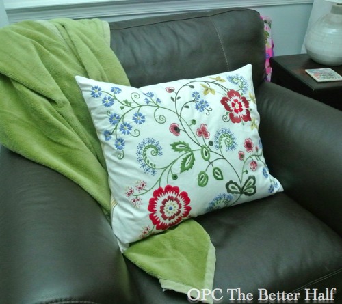
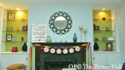
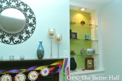
All that factored together, I picked green – specifically Spanish Olive, using Behr Premium Paint.
After I painted one side and consulted with my friend, Ruth, I added white paint to the Spanish Olive in attempts to brighten it a bit. It didn’t lighten it too much since the Spanish Olive used a deeper base, but it did lighten it some.
Overall, I’m still not sure I love it. Its more neutral than I was hoping and looks very dark when the spot lights are off in the built-ins. (Ignore the Lucy Banner, I am also in the midst of prepping for Lucy’s birthday party)
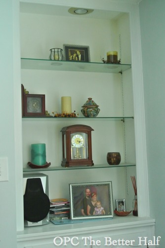
Also, the current decor on the shelves will NOT be staying, but for now it helps it to look like we live here. 🙂
What do you think??? Opinions and suggestions for color are welcome!!
As always, thanks for reading!


Looks fine with the spots on. Maybe you should post a pic with the spots off if you tend to leave them off and are afraid it is too dark.
i love the built ins and the new icy blue! i am not sure about the green though- i think the fireplace is a standout and it is so cool, and the green distracts from that. i think a charcoal gray that would tie into the fireplace would look awesome!
I think I’m with Cassie on this one. I think gray would be great with the blue. That way the blue will make the fireplace the focal point. 🙂
I immediately thought a coral would be awesome, to pop with the warm floor.
I agree with Cassie and Megan
Not loving the green. Do you want to go with a different color? We have built-ins in our dining nook. I painted the backs of them a deeper shade than the walls.
Have you considered that?
Scroll down to the third photo to see mine:
http://paintergalscottage.blogspot.com/2013/01/anyone-want-to-buy-cutest-little-house.html
I love the wall color! What about a slightly darker shade of that blue for the back of the shelves? Just a little contrast, but not too much. Then add the green and other colors from the pillow in accessories on the shelves.
I like the look of a darker shade of the wall color as well. If you like the idea of stenciling but want to keep the mirror you could try something like Pretty Handy Girl did. I dream of having built-ins and copying this idea from her one day!
http://www.prettyhandygirl.com/2010/08/painting-decorative-graphics-on-wall.html
I had considered a pallet wall like PHG but i get bored really quickly, so that is a little more permanent than I would like, also probably a little too rustic for the space. Love the idea though!!! 🙂
maybe I accidentally put the wrong link. I was trying to show you her built-ins by her fireplace. She did a darker shade of green and painted on a graphic that showed through after she reinstalled the shelves.
Wow, everyone beat me to the punch! My first thought was something similar to the silvery gray we are painting in my living room… or a darker shade of the wall color. A completely different color clashes too much. However, I get the thought of splashes of color. In order to pull off the green, you would need a huge canvas that was painted with themes and colors similar to the pillow that inspired you…. defeating the purpose of keeping the mirror. Just my two cents. Coral would be a beautiful accent for decor, but I think Coral paint would give you a “beachy” look, which I don’t think you are going for.
I personally LOVE the green! It’s so fun and bright! I’m not sure of the combination of it with the icy blue though. If the walls were gray then the green would go better. If the green is too dark I’d just get a brighter green.
You could try a textured wallpaper or burlap? That’d add some fun and contrast to the shelves.
Thank you all for the great ideas! I had Lucy’s party yesterday morning and all of the mom’s really like it in person (more so than when they saw the post before they came). But I’m still not loving it…. Ethan is urging me to wait a bit and live with the green but I don’t think its going to stay. Thanks for helping me feel empowered to paint again!
Just out of curiosity…why the push to redesign? I loved the old look. Can’t say I’m as big of a fan of the icy blue…it feels “cold” to me. Judging from the other comments I’m alone in that though…haha. You wanted my opinion!!
The shelves look nice…though if it were me I’d feel pressured to always leave the spots on
This could not have turned out any better. I do think the pop of color was surely needed, and yellow really would have been difficult to decorate with.
As always you did an amazing job.
Personally I would paint them a dark blue to complement the blue walls or a dark gray to match the couch and mirror on the wall. Then, if you think it’s too dark you could change the light to a fluorescent for a more washed out light compared to the spot. Or even a couple more lights.
I didn’t read others comments as to not influence my opinion. So here’s what I think: The white built ins fade into the pale blue walls. If this were my choice I’d paint just the fire place wall in the green and repaint the backs of the built ins to match the rest of the walls.
You guys are seriously awesome, now if you could just come do the work, that would be great. thanks. 🙂
Have you decided what you’re going to do yet Jocie? If so you are faster than me. I’ve had paint and fabric bought for three rooms and I keep changing my mind.