This has been a busy week around the home improvement blogs! So many of you have beautiful projects, and we’ve got a great set of DIY features coming this afternoon with our {second} Link it Up DIY party. But one “reveal” this week really caught our eye here at OPC. Lindsay Ballard over at Living with Lindsay gives us the culmination of a year-long master bedroom renovation! Lindsay’s new master bedroom is trendy and stunning. She says:
“It may be too bold for some. It may be too busy for others. But for me? It’s just right.”
Well, we think it’s neither too bold nor too busy. Lindsay’s done an awesome job with the space! It’s inspiring us to think about our own master bedroom, which we’ve been putting off for years as we focused on our first floor reno, the OPC workshop, and my little ones!
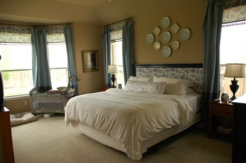
Here’s what it looked like “Before” (…and yes, it’s a little embarrassing that this “before” picture looks more put together than our bedroom right now!)

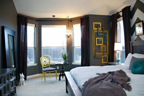
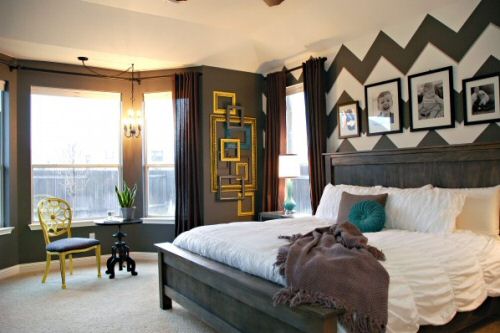
And here’s what it looks like, now! Whoa!

Check out those bold chevrons, and the pictures of the kiddos over the bed… Adorable! And the contrasting frames and side chair really pop right out of the background.

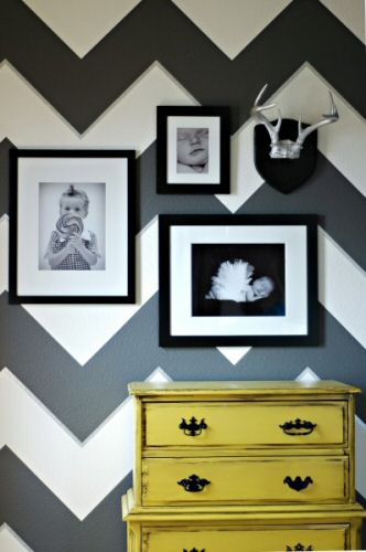
Don’t you just love the contrast between her refinished yellow dresser, and the chevron stripes in the background?

And how about those antlers? They’re reminding us of John & Sherry’s Self Imposed Challenge over at YHL.
The only question we have left after looking at Lindsay’s redesign is: Did her blog header inspire the room, or vice versa? 🙂
Seriously sweet redesign, Lindsay!
Want more pics? Head on over to Lindsay’s original article for complete details on all the changes in the room, including a few tutorials!
And stay tuned for this afternoon’s {second} Link-it-Up party!


Wow. That’s about the only word to describe that. How does one even decide on something that bold?! Maybe my imagination is limited. I would have a hard time trying something that dramatic. I would chicken out before dramatic met up with fantastic. That room is great.
Thats very dramatic indeed. I like it but I’m not brave enough to paint a room that dark.
I think this bedroom is awesome! It is BOLD, but somehow all works well together, all the design and the colors. Just awesome!
Fred’s and my favorite part is that her bedroom now goes with the header of her blog! 🙂
Ditto. It’s more bold than I would attempt but somehow you made it work. Congrats. Now that I think about it, my wife has this artsy candle holder that she insisted we put up in our bedroom…it takes up the same amount of space as your picture frame medley, so maybe we aren’t that far off after all.
This is fabulous! I would copy this in a heart beat, but I would have to sweet talk my sweetheart into it. 🙂
My question is…did Lindsay make the picture frame art herslef? I’m heading over to her blog to find out.
Very Domino! Beautiful job!
GreenGardenista! Welcome back!
Thank you SO MUCH for featuring my bedroom! I appreciate the nice comments!
And just so you know…the header and bedroom were designed concurrently. BUT…I didn’t even realize they were the same colors/theme until several months later. Well, I knew that I was doing chevrons for both, but I didn’t even think about the fact that the colors were the same. I guess I have a one track mind. 🙂
Well it’s excellent for “brand recognition,” right? It was your subconscious business plan all along… At least your mind’s one-track is a classy one! I wish I had your gift for design!